Tuesday, 30 September 2008

Tate Modern


When I went to the Tate Modern a few years I was blown away by the building and by Rachel Whitereads exhibition. The massive entrance hall is literally stunning and the work I saw on show their that day really helped me with work I was doing at the time. I have to say I usually dont like museums but that trip was well worth it!

FaulknerBrowns Architects


Here is a new identity designed for FaulknerBrowns courtesy of London based design studio A2/SW/HK. The orginal company identity was a confusing mess of too many typefaces, weights and colours. A2 decided to totally simplify the company images. The end design was based around stripping the outline of the company name and leaving only the counterforms remaining from the letters A, R, B, R, O, A and R. I think this design is very unique, clever and simple and really does prove that less is more.

Abduzeedo

http://www.abduzeedo.com/
This site is definatly my greatest form of inspiration. If I'm ever stuck for ideas, cant figure out how to do something on photoshop and need a tutorial, or just want to be simply wowed by others work, then this is where I come. Abduzeedo features work by up and coming talents, people who have original styles and tells you how to create similar effects on Adobe and other programs. The design of the site itself is nothing special but thats not why I am posting. This site is like buying a copy of creative review or going for a windy walk, it helps me think and never fails to inspire!

Toyota Matrix

www.fullofpotential.ca/

This is a cool site, the designers have managed to add excitement to an otherwise boring and uninspiring car. Lets face it the Toyota Matrix is'nt exactly a Ferrari so it's hard to get people excitied and interested but this site has definatly done that! The sites takes it's concept from the very cool intro movie for the site, in which the Toyota Matrix is driving around a city at day time with its full beams on, turning everything they shine upon into night time and partying fun etc etc. It's a very nice idea and is hard to explain so just watch it on the site! The site is based around a 3D model of the Matrix, your cursor is the full beams which makes everything look alot cooler and more interesting when you roll over anything on screen. You can also move around the car by moving the cursor to the edges of the screen. This is no ordinary website and almost resembles a computer gaming menu, and shows what happens when people think outside the box.


Santos Saul - A touch of class

www.santossaul.com

This is one of the simplest, sleekest classiest sites I've ever seen. Photographer Santos Saul Diaz shows us how to perfectly present your work online. I love how he lets his amazing photo's do the talking without clogging up the site with other crazy menu bars or animation. The site is not only beutiful but cleverly put together as well, every page has a stunning high definition background which leaves me stunned while the simple and shiny menu's are stylish and functional.

Suzie G

www.suzieg.co.uk


Webdesigners at vivid imaging created this very cute site for jewellery company Suzie G's Gypsy Baby collection. The site does really well in encapsulating the brands bohemian style with its gypsy images and styles. I really like the loading bars on this website too, see below. The site starts off with a video navigating the viewer through some stills showing the range of jewellery while playing some spooky carnival style music. I recommend everyone checks this site out because the site perfectly fits with the product, as any site should!

Moon Palace

www.moonpalace.fr

Alexandre Soubrier a French graphic designer created this innovative site for his online portfolio. I noticed it in the magazine webdesigner last year and I've never forgotten about it. The site is an animated spinning earth with an orbiting moon and other satellite type objects that serve as the navigation. Alexandre has not sacrificed any usability as the site is easy to use yet visually explosive. The site isn't exactly slick but keeps you interested shows just how experimental you can be with online portfolio's.

Sunday, 28 September 2008

Kinetic Sculpture


I was reading an article in Design Weekly about a new trend of experiential and sensory exhibitions, designed to draw audiences in and get them to participate in their environment. I was particularly struck by the kinetic sculpture in the BMW museum in Munich. This extrodinary exhibition uses 714 digitally controlled metal spheres to form shapes and patterns. Technology is now getting so advanced that it no longer even interferes with the design itself. The metal spheres seem to be floating in mid air when they are actually suspended by computer controlled wires. In the video you can see the spheres form the out line of classic BMW cars.


Wednesday, 24 September 2008

Beijing Olympic Stadium


I can imagine everyone was just as astonished as I was when they watched the beginning of the Olympic games. Im not sure what stunned me more the amazing opening ceremony, the sheer size of the stadium or Usain Bolt's 100 metre finish time! I hadn't really been following the progress of the games or the construction of the stadium so it totally took me by surprise to see a giant birds nest. All of the 110, 000 tons of chinese steel make this the largest steel structure in the world, and at $423 million it was built for one tenth of the cost it would have taken to build in the west. Swiss architect firm Herzog & de Meuron are responsible for the amazing design of this building, and they see the nickname 'the birds nest' as something of a compliment, "In China, a bird's nest is very expensive, something you eat on special occasions." Although the olympics are over the stadium will still be used for football games, and there is also a planned exstention for a shopping mall and hotel to increase its use.


BMW Museum


Above you will see the BMW four cylinder building and in front the BMW museum. Although contructed in the 70's these building remain unique to this day. The special technique involded in constructing the four cylinder was that each of the 22 floors had to be contructed on the ground and then pulled up to the top, each floor hanging from the one above. The museum on the other hand is a self supporting body, the reinforced concrete shell of the building supports the roof. I love how BMW have the audacity to stick a giant 41 diameter BMW logo on the roof of the building!

Thursday, 18 September 2008

Pans Labyrinth


A fascinating magical tale set in fascist Spain 1944. The story of a young girl and a fantasy world created in her own mind to survive the harsh reality of a real world she is not prepared for, set in a not so tranquil Spanish war time countryside this is a charming, graphic and sometimes dark fairy tale. The art direction in this film is amazing, I'm sure most of you will have seen this film, when I went to see it at the cinema I knew little about it and wasn't expecting it to be in Spanish with subtitles through-out the whole movie. I strongly believe the foreign aspect added to this movie, it helped to create the illusion of another world and it's not often you see a film of this scale and budget that isn't in English dialogue, it was a refreshing change. This dark adult fairy tale has some very interesting characters, especially the Child Catcher. The set design, characters and story line make this fantastic film a must see.

Cai Guo-Qiang’s “I Want to Believe.”


During February of this year the Guggenheim New York played host to Cai Guo-Qiangs most ambitious show so far. Known especially for his use of explosions in a wide range of work and mediums Guo-Qiang 's grand installation shows actual real size cars hanging from the ceiling of the Guggenheim spiral. Guo-Qiang's work, which took over the whole museum for the show, also features a long streaming pack of wolves. You cant help but admire the sheer amount of motivation and perspiration involved in a project like this!


Wednesday, 17 September 2008

majestic

At this Rate

Now I keep seeing this popping up in various design mags so thought I would include it in my blog. Studio 8 designed this magazine or book or whatever you want to call it for the Rainforest Action Network to raise awareness about deforestation. I like the imagery used as it's organic looking and at first glimpse resembles dying leaves, but it's actually aerial photography of land that is being deforested. The book is also made from 1 single sheet of recycled paper that folds out from the cover into a 12 page concertina. Innovative and environmentally friendly!

Baked!


Now this is a great idea! Croation creative agency Bruketa & Zinic created an annual food report for a company called Podravka that must be baked in an oven for 20 minutes before it can be read. Entitled 'Well Done' the book consists of blank pages printed with a thermo-reactive ink that once wrapped in foil and cooked will reveal text and images. It just shows that books can be more than just a boring collection of information, with some lateral thinking and a quirky sense of imagination the boundaries of book design can really be pushed.


Guggenheims


I've always loved the Guggenheim museums, especially the spiral in New York and the Guggenheim Bilbao in Spain. They look like they've been designed from the future, they don't belong in the landscape at all but there definitely a breath of fresh air. These two museums are pushing the boundaries of what is possible both in construction and concept.


The Guggenheim Bilbao (above) has been described as the greatest building of our time and I would agree. The free flowing organic contours of the building are textbook Frank Gehry design. As Bilbao is a Port town the whole construction was meant to resemble a ship, the side of the building is coated in reflective titanium resembling fish scales. Computer simulations made the construction of this design feasible although architects of an earlier era would have found this impossible.

Tuesday, 16 September 2008

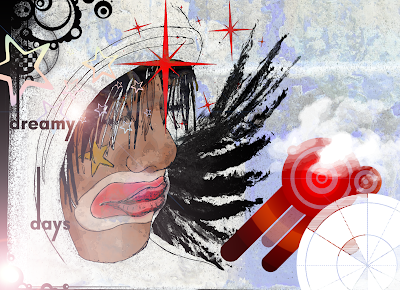
dreamy days

I'm loving the new scanner, for some reason I had the urge to draw a clown, so I did, scanned it in and created this...


heres the original sketch...

a new fragrance by...


was having a play around with some new brushes and textures and ended making this... thought it could be a sleek mysterious look for a brand of perfume.

orginal photo is below.


my scanner arrived! I sketched the asian girl by hand and then scanned her in, added some shading, vectors etc and came up with this... very much influenced by Russ Mills.

Monday, 15 September 2008

Se7en

One of my favourite all time films with out a doubt. The intro to Se7en really sets the scene for whats to come, sinister, dark, gorey. The close up of the murderer slicing off the skin of his fingertips isn't for the squeamish. Thought has been put into the choice of typography as it mimic's that of a mad mans scribblings, the whole sequence is gritty and dark which is carried on throughout the rest of the movie. Many opening sequences to thrillers have clearly been inspired by this one...

Nip/Tuck


Anyone ever watched it? It's not a bad program, I really like the intro the use of manaquins is a nice touch, they could have used real people, but manaquins are more associated with shop windows and fashion which questions the whole idea of plastic surgeory and vanity, yet they also look like sculptures or ornaments, which we would associate more with the desire of perfection. The intro is portraying the surgeons as craftsmen or artists, starting with a blank canvas or in this case a blank dummy and gradually bringing it to life.


Stranger than Fiction

A distinctly average film, if only it was as good as the opening sequence by MK 12 studio's. Stranger than Fiction follows the life of Harold Crick, a simple IRS auditor who one day wakes up to have his life being narrated step by step. Although the film isn't great the producer does manage to keep you constantly interested and engaged with the use of playful camera angles and inframe oddities. MK 12 studio's created a very edgy looking intro for the film, based on Harold's obsessive compulsion for numbers. For instance he would know how many steps it is to the bus stop or his mind would be constantly measuring distances between inanimate objects, all this information has been cleverly overlayed to create a sort of Heads Up Display (HUD). Take a look...


the outro is pretty neat too!


A scanner darkly


I've chosen to blog about A scanner darkly, not because it's my favourite film, in fact I've only seen it once and I'd definatly have to see it again in order to understand it, but because this is a film that pushes the boundaries of cinematography... and I am a graphics student afterall! The story is based on an undercover cop in a not-too-distant future who becomes involved with a dangerous new drug and begins to lose his own identity as a result. This is a very immaginatve and complex cult film, it's not a cartoon... in fact the whole film was recorded with real actors including Keanu Reeves himself, and then the whole thing was cell shaded over. The detail is incredible and gives a very unique look that suits the quirky style and content of the film. A film that definatly needs repeated watching in order to take it all in.


Russ Mills


This guy has totally inspired me to be more hands on with my design, he uses lots of scanned elements that he draws himself, and tries to keep layers and filters to an absolute minimum. This is the type of work that I really love and I've just bought a scanner which should arrive soon, and tomorrow I am going to buy some graphic pens... my Russ Mills inspired works shall be online soon!


Russ Mills:
"For my Graphic work I compile as much source material as possible in the form of textures , random marks and scribbles etc and scan it all, the primary image is drawn and also scanned. I then manipulate the constituent parts on the computer, I keep the amount of layers to a bare minimum so the results are as spontaneous as possible. I dont use any filters at all to keep the 'digital' nature of the image to a minimum.

....if you look at the people I have linked to it will give a good insight. Additional past masters such as Van Gogh, Picasso, Pollock, Basquiat also have a great influence in what I do."

who the hell is HORT


As I've just bought my booka shade ticket, who are soon to be getting their style on in stylus, I thought I would do a little review of HORT. Why? well they've designed all of booka shade's new artwork for the new album The sun and the neon light (above). I heard about them on a booka shade interview and thought I'd look them up, and I'm glad I did because these guys and girls are designing from the future! Their work is totally modern and totally amazing...

I love the new album sleeve, check out the contrast between modern typography and the older cubist sytle installation. They took elements from the typography made giant 3D models of it and then projected booka shade's faces onto it... genius!


The same style has been used to create a limited edition K-Swiss trainer which booka shade are using as a give away on their website. They've done some cool posters too, it's barely readable but it doesn't matter! They've created their own brand of booka shade. Check out more of their work here


Mandarine Girl


An illustrative design idea that I'm working on, could be used for a fashion magazine or album sleeve, something along those lines.